No products in the cart.
Style
Why we love colours?
Colour Theory
The foundations of pre-20th-century color theory were built around “pure” or ideal colors, characterized by different sensory experiences rather than attributes of the physical world. This has led to a number of inaccuracies in traditional color theory principles that are not always remedied in modern formulations.
Another issue has been the tendency to describe color effects holistically or categorically, for example as a contrast between “yellow” and “blue” conceived as generic colors, when most color effects are due to contrasts on three relative attributes which define all colors:
- Value (light vs. dark, or white vs. black),
- Chroma [saturation, purity, strength, intensity] (intense vs. dull), and
- Hue (e.g. the name of the color family: red, yellow, green, cyan, blue, magenta).
The visual impact of “yellow” vs. “blue” hues in visual design depends on the relative lightness and saturation of the hues. Many historical “colour theorists” have assumed that three “pure” primary colours can mix all possible colours, and any failure of specific paints or inks to match this ideal performance is due to the impurity or imperfection of the colorants. In reality, only imaginary “primary colours” used in colorimetry can “mix” or quantify all visible (perceptually possible) colours; but to do this, these imaginary primaries are defined as lying outside the range of visible colours; i.e., they cannot be seen. Any three real “primary” colours of light, paint or ink can mix only a limited range of colours, called a gamut, which is always smaller (contains fewer colours) than the full range of colours humans can perceive.
Why we opt for sensory satisfaction vs healthy food?
Would you drink brown tomato juice?
If given a choice, most likely you would refuse the brown tomato juice in favor of the same stuff doped with an artificial chemical that stains the juice bright red. Even though you know that the brilliant red color of tomatoes fades with time after caning, and you know the red colored artificial chemical does nothing for taste or nutrition, you can’t help yourself from consuming the adulterated juice instead of the faded colored juice in its natural state. Is this rational?
Color preferences are deeply rooted emotional responses that seem to lack any rational basis, yet the powerful influence of color rules our choices in everything from the food we eat and the clothes we wear to the cars we buy. For some people, owning a green car is unthinkable. These shoppers will gladly pay hundreds of dollars more to obtain the vehicle in a different color, or they will reject the green car and select an entirely different automobile in a color they favor. We all do this even though the color has absolutely no influence on the performance of the automobile. Yet oddly, someone else will feel exactly the opposite about buying a green car. These individuals will gladly pay a premium to purchase a vehicle in the shade of green they adore. We like to think of ourselves as being rational, but in fact we are ruled by the unconscious and mysterious power of color. Where do our color preferences come from?
Nothing but light!
In an essay in 1973, Biologist Theodosius Dobzhansky, famously observed that “nothing in biology makes sense except in the light of evolution.” Psychologists Stephen Palmer and Karen Schloss of UC Berkeley, apply this viewpoint to the question of color preference in an article published in 2010 in the Proceedings of the National Academy of Science. They tested the theory that human color preference is adaptive; that is, people are more likely to survive and reproduce successfully if they are attracted to objects with colors that “look good” to them, and they will avoid objects with colors that “look bad” to them. The idea is that the more experience-based feedback that a person receives about a particular color that is associated with a positive experience, the more the person will tend to like that color. They proposed that in general, people should favor colors associated with clear sky and clean water (blue and cyans for example) and be repulsed by colors associated with negative reactions (brown, for example, which is associated with rotting food and feces.)
To test this, they studied 48 participants who were asked to rate 32 colors in terms of how much the participant liked the color. The results showed that brightly saturated colors were preferred over the same hues that were muted or pastel, but not all colors were equally favored. Brown and olive green were significantly less preferred than orange or yellow. Bright reds, blues, and green, were the most higly favored colors. The results of the study produced a sort of “color wheel” ranking of the 32 colors, but it’s not the color brown that repels us from drinking brown tomato juice. Brown colored chocolate milk does not evoke the same psychological revulsion. The problem with this test is that the colors were not associated with objects.
Colour Harmony
It has been suggested that “Colors seen together to produce a pleasing affective response are said to be in harmony”.[2] However, color harmony is a complex notion because human responses to color are both affective and cognitive, involving emotional response and judgment. Hence, our responses to color and the notion of color harmony is open to the influence of a range of different factors. These factors include individual differences (such as age, gender, personal preference, affective state, etc.) as well as cultural, sub-cultural and socially-based differences which gives rise to conditioning and learned responses about color. In addition, context always has an influence on responses about color and the notion of color harmony, and this concept is also influenced by temporal factors (such as changing trends) and perceptual factors (such as simultaneous contrast) which may impinge on human response to colour.
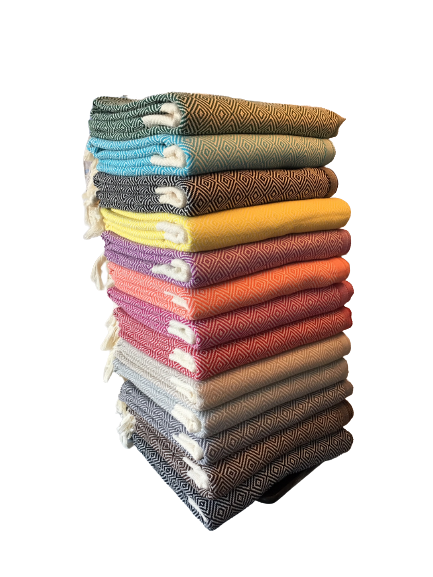
By whom, you may ask. Well, that is arguable. However, there are highly reliable sources in the world that we can turn to for an answer. The Pantone Color Institute for instance is a reference point I turn to before creating HforHammam`s new season hammam towels and throws. Pantone not only serves as a tremendously valuable reference resource, but also provides fascinating read in general. Aren`t you also quite curious about where all those colour names come from? When redecorating a house, my favourite part is browsing through the colour chips, say Farrow&Ball or Dulux paint chips, in any case there is no shortage of fun!
Test your colour knowledge
See if you can picture any of the colours below as you see their names. Following list derived from some of the colours from Dulux.
| Blueberry White | Mineral Mist | Blissful Blue | Misty Sky |
| Quintessential Blue | Frosted Lake | First Dawn | Bluebird Skies |
| Coastal Grey | Blue Babe | Blue Lagoon | Vast Lake |
| Nordic Sky | Denim Drift | Stonewashed Blue | Sea Blue |
| Sapphire Salute | Breton Blue | Sapphire Splendour | Lost Lake |
| Oxford Blue | Striking Cyan | Atlantic Blue | First Frost |
| Pistachio Whip | Ocean Ripple | Peppermint Candy | Atmosphere |
| Lagoon Falls | Mint Macaroon | Blue Reflection | Marine Splash |
| Teal Facade | Neptune Seas | Proud Peacock | Teal Tension |
| Teal Touch | Teal Ripple | Nordic Spa | Wellbeing |
| Spring Meadow | Antique Map | Crushed Aloe | Overtly Olive |
| Putting Green | Fresh Sage | Enchanted Eden | Forest Shade |
| Olive Groove | Pixie Green | Heatland | Buckingham |
| Emerald Glade | Vanilla Scoop | Fresh Stem | Melon Sorbet |
| Luscious Lime | Kiwi Crush | Lemon Pie | Banana Split |
| Vanilla Sundae | Lunar Falls | Lemon Tropics | Lemon Spirit |
| Pale Citrus | Soft Vanilla | Wild Primrose | Sunny Day |
| Butter Biscuit | Lemon Punch | County Cream | Citrus Zing |
| Soft Coral | Apricot Crush | Tangerine Twist | Moroccon Flame |
| Orange Fizz | Tuscan Terracotta | Coral Flair | Copper Blush |
| Monarch | Redcurrant Glory | Sumptuous Plum | Cranberry Crunch |
| Raspberry Diva | Fuchsia Lily | Berry Smoothie | Love note |
| Faded Damson | Satin Bow | Volcanic Red | Ballerina Dance |
Out of above 100+ colours, how many of them you already knew?